**Part 3 Includes HOF likelihood score and Tableau with all 100 seasons and more accurate data**
http://threepointgames.blogspot.com/2018/01/era-adjustments-part-3.html
This is a continuation of my first post seen here.
At the end of my last post, I mentioned several areas which I hoped to update, and in this post, I will address new changes.
The first change I made was switching the goal rate multiplier to a point rate multiplier. The relationship between these two is very strong, so the change wasn't too significant. This broadly means that over the last 50 years the NHL has generally assigned assists per goal at an even rate. I was also able to add the 2016-17 season to the data.
The next change I made was in the multiplier calculation. Originally, I converted each season from individual observations into percentiles so the seasons could be compared (different number of players each season). The percentile bins had different numbers of observations so this required the regression lines/multiplier as seen in the previous post. Instead of this method, I found the regression line for each season's Lorenz curve (Lorenz doesn't have a predict function), and using these curves I found the share for each player and created new multipliers. This method seems to have worked better and I'll be sharing the new top 20s below.
One of the observations made in the last version was Mario Lemieux's absence from top seasons. Because he played at the same time as other high scorers, this adjustment views this as meaning it was "easier" to achieve his results. Similarly, since there was a large gap between him and #1 (Gretzky), the adjustment was typically a little harsher on Lemieux. With that said, this new adjustment was more favorable to Lemieux, moving him up two spaces in career PTS and giving him more top 20 seasons.
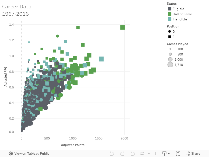
I also did some work looking at adjusted stats with HOF data to see how current players compare. This has been done in the past with previous adjustments and other era-adjusted stats and I just thought I'd give it a try. Here is a quick Tableau visualization I made for all career adjusted regular seasons stats from 1967-68 to 2016-17, showing HOF qualifications.
**For some reason the x-axis isn't loading but it is Adjusted Points
https://public.tableau.com/views/AdjustedPoints/Sheet3?:embed=y&:display_count=yes
http://threepointgames.blogspot.com/2018/01/era-adjustments-part-3.html
This is a continuation of my first post seen here.
At the end of my last post, I mentioned several areas which I hoped to update, and in this post, I will address new changes.
The first change I made was switching the goal rate multiplier to a point rate multiplier. The relationship between these two is very strong, so the change wasn't too significant. This broadly means that over the last 50 years the NHL has generally assigned assists per goal at an even rate. I was also able to add the 2016-17 season to the data.
The next change I made was in the multiplier calculation. Originally, I converted each season from individual observations into percentiles so the seasons could be compared (different number of players each season). The percentile bins had different numbers of observations so this required the regression lines/multiplier as seen in the previous post. Instead of this method, I found the regression line for each season's Lorenz curve (Lorenz doesn't have a predict function), and using these curves I found the share for each player and created new multipliers. This method seems to have worked better and I'll be sharing the new top 20s below.
One of the observations made in the last version was Mario Lemieux's absence from top seasons. Because he played at the same time as other high scorers, this adjustment views this as meaning it was "easier" to achieve his results. Similarly, since there was a large gap between him and #1 (Gretzky), the adjustment was typically a little harsher on Lemieux. With that said, this new adjustment was more favorable to Lemieux, moving him up two spaces in career PTS and giving him more top 20 seasons.
 |
| Adjusted PTS | Difference | Player | Season Top Seasons |
 |
| Adjusted PTS | Difference | adj PPG | Player Career Data |
I also did some work looking at adjusted stats with HOF data to see how current players compare. This has been done in the past with previous adjustments and other era-adjusted stats and I just thought I'd give it a try. Here is a quick Tableau visualization I made for all career adjusted regular seasons stats from 1967-68 to 2016-17, showing HOF qualifications.
**For some reason the x-axis isn't loading but it is Adjusted Points
https://public.tableau.com/views/AdjustedPoints/Sheet3?:embed=y&:display_count=yes
Comments
Post a Comment