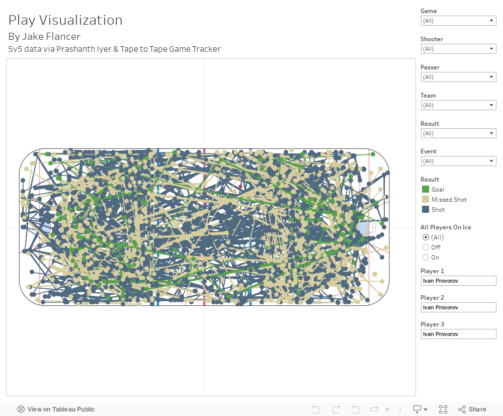
tapetotapetracker.com has created an excellent way to track shots, shot assists, and zone entries. Using an 11 game sample of 5v5 data from here provided by Prashanth Iyer, I created a Tableau visualization to map the shot and shot assist data. This data includes all shot attempts classified by type, and when relevant the pass leading up to the shot. The "origin" is where the passer makes the pass, and "destination" is where the pass is received. Finally, each shot is denoted as "goal" "shot"- SOG or "missed shot", and the location is where the shot was taken.
Some features include viewing by the shooter, passer, team, and game. You can also select specific events and results. Result filters an entire event by what its end result was. For example, if "goal" is selected, it will show all events (origin+destination+shot) which resulted in a goal. Similarly, event filters for individual events. This means that specific types of events can be removed, such as the passing info. If "origin" and "destination" are deselected, you will essentially be viewing a shot chart. The final feature lets users view events occurring when an individual player or combination is on the ice. If using the preset settings for the viz, when All Players On Ice is selected as "On", it will just show events in which Philadelphia Flyers defenseman Ivan Provorov is on the ice. This feature is currently set to allow a maximum of three players, who can be on either team. When "Off", it will show attempts when that player or combo of players is off of the ice.
If you are interested in viewing how the Tableau was created, the workbook should be available to download. However, the data being used is not directly from the dropbox link above. I used an R Script to format the data correctly before connecting it to Tableau. I don't have a dropbox set up, but if you'd like to see/use the script I'd be happy to send it- just reach out to my contact info on the side.
Also, once I get more data I will start to convert gameId to more relevant info.
The Tableau is embedded on this page and here is a link to the Tableau dashboard.
Hey Jake,
ReplyDeleteQuality blog you've got yourself here. I look forward to your full post about predicting success based upon WJC performance. I just thought I'd let you know that, it may just be on mobile, but it was fairly difficult to change the names from Ivan Provorov. I did manage it, but I think the issue might be with the auto-fill function. It seems to me that that was it's main issue. Other than that, good work so far! I assume most of this is based upon some sort of college cirriculum, but one thing constantly on my mind is trying to find ways to objectify player upside. Obviously it would be a hard thing to accomplish, and to my knowledge nobody has publicly done it perfectly yet, but someone has to be first! Just my two cents.
-68